Thursday, June 21, 2012

Law Enforcement Participation Activity

Title of Article: The Incident Map Symbology Story
Original Article Written by: Lt, Chris Rogers, Kirkland Fire Department
Summary Written by: Catherine Bronson
Date Posted: June 21, 2012

            We all know that certain symbols are universal in a particular community or society.  We all know that a red sign at the end of the street means stop, a green light means go and a yellow triangle means caution.  Maps are the same way for those who need to use them.  We all know that N means north on a map.  First responders of all types need maps to negotiate where they are, where they are going and to make quick analysis of dangerous situations.  In order to do this, the maps they use need to have symbols that are easily recognizable.  These maps come in many forms, from paper to computer, some hand drawn and some computer generated.  Many of these first responders are now using GIS for construction of their maps and integrating their data.  The problem arises when different types of first responders use different symbols and different map forms but need to work together.  A specific incident may involve local organizations such as town police or fire, state organizations such as spill response units, state police and health and natural resources officials along with federal organizations like FEMA and the Red Cross.  They may all be using different forms of maps such as:
            Street Maps
            Emergency or building pre-plans
            Incident command and control applications
Damage assessment applications
Crisis management systems
And many others

Different responders have different terminology, priorities and data needed.  However, they all have the same goals of protection, fast response and mitigation and need to work together as a group to achieve these goals and therefore need consistent data.  According to Lt. Rogers, this is often called a Common Operating Picture.

            A common symbol known by various responders makes critical and timely decision making easier and clearer.  The problem arises that different organizations have different needs and different terminology.  An example of a success story for standardization of symbols is the National Wildfire Coordination Group.  This standardization of map symbology makes maps clearer and easier to understand.  However, this symbology does not work for other groups.  Another group under the US Department of Homeland Security attempted to create symbols included into four categories: Incident, Infrastructure, Sensors and Command Features.  There were issues with this set of symbols such as they were too graphical and hard to hand draw, some symbols were vague in their purpose due to a variety of definitions in various agencies and although over 200 symbols were created, there were still a lot missing.

As a solution to this problem was the creation of a group with the help of the NAPSG Foundation.  This group consists of people representing various first responder organization and requiring that the members have practical hands on experience as emergency responders and practical knowledge of mapping and GIS.  This group of responders were first presented with a challenge to create a map that showed the features: Hazards on an incident, Features that can help mitigate and incident and Mapping where command functions are located.  They then presented the map to the group.  At the in-person meeting they discussed each map and looked for common features.  What was decided at the meeting was the following requirements:

            A set of guidelines instead of standards
            Symbols that can be hand drawn
            Symbology that does not require a lot of training to understand
            Symbology must be usable in routine business of public safety agencies

Along with the acknowledgement that two types of maps are needed, a Tactical Map with a single problem emergency and a Strategic Map for a multiple problem emergency.   Below is an example of these types of symbols on a Strategic Map.


            This group that came together made a good start identifying the problem and the broad solutions to this problem.  They decided from the beginning that they did not wish to “re-invent the wheel” and to keep in mind that what they came up with needed to be flexible, scalable and consider all the hazards first responders may encounter from the smallest incident to a multi organizational large event.  I found this article very informative particularly with my involvement as support for some of these first responders and having taken FEMA courses.  I can see where there will be a broad benefit to the many organizations that need to come together to solve issues at hand and I see where there will need to be flexibility as different uses are and different priorities are met.

Friday, June 8, 2012

Hurricanes - Coastal Flooding from Hurricane Katrina

In this lab we were to assess the damage from storm surge caused by Hurricane Katrina to  three counties in Mississippi.  The three counties Hancock, Harrison and Jackson Counties are all on the Gulf Coast with wetlands and barrier islands that normally protect the coast from too much damage.  We are told that the wetlands and coastal woodlands are important not only for habitat but also for the economy due to the fishing and paper industries.

Looking at the maps, we can see that many of the populated areas are along the Gulf coast and rivers.  The storm surge inundated the coastal communities, wetlands, coastal forests and inland. 

This map shows the elevation and hydrography of the three counties and the surrounding area.


This map shows the flooded areas with a graph of percentage of type of lands flooded.


This map shows the infrastructure and health facilities at risk from storm surge.


This Map is an addition showing the table with acres of coverage per type of land.

Using these maps as reference, I would suggest that the first priority would be to repair damage to Highway 90 that runs through all three counties along the coast.  Along this highway are the majority of hospitals and populated areas.  This highway will be essential to bringing more aid in and allowing access to vital health facilities and communities. Restoring the wetland and forested areas to bring the economy back to a viable and sustainable working area will need to be a priority after these first essential areas are repaired.

Process Summary

Deliverable 1:
1)      Examined the directory structure
2)      Documented the map for “Coast1”
3)      Set the environments
4)      The instructions said to Expand General Settings.  There was no “General Settings” that I saw, so I chose “workspace” and it seemed to be the same thing.
5)      Used the Mask function to limit the analysis to the three counties.
6)      Set the features for the Elevation feature class.
7)      Added the layers islands, water and river layers, setting the symbology.
8)      Created a map showing elevation, hydrology and populated areas.
9)      Exported as Coast1_cmb.jpg 
Deliverable 2 and 3:
   Documented the map for “Coast2” and set the environments
1)      Used the Spatial Analyst feature and the Math toolset to calculate the storm surge in meters and to isolate the area flooded by the storm surge.
2)      Used the Reclass tool to “reclassify” the land values.
3)      Saved the output raster as “reclandcover”
4)      Isolated the flooded land cover using the Times tool and saved the raster as “floodedlc”.
5)      Relabled the reclassified flooded land cover by adding new field to attribute table.
6)      Saved as a new layer.
7)      Added the counties, places and island layers and labled and symbolized.
8)      Calculated the percent in the attribute table and created graph of flooded land by land-cover type.
9)      Added the graph to the map. Saved and exported the map of flooded land and graph to Coast2_cmb.jpg


Deliverable 4 and 5:
   Documented the map for “Coast3” and set the environments
1)      Added counties and usa_streets layers. 
2)      Changed the symbology
3)      Added railroads, hospital and churches layers and symbolized
4)      Added flooded_land layer and made 50% transparent instead of 25% because I thought it worked better to show the other information more clearly.
5)      Calculated the acreage by clearing map and adding counties and floodedlc layers. 
6)      In the floodedlc attribute table added two float fields “acres” and “sqmiles”
7)      I tried to add this table to the Coast3 map but I couldn’t get the sizes to work right.
8)   Saved and exported the map of infrastructure impacts to Coast3_cmb.jpg

Thursday, May 31, 2012

Natural Hazards/Earthquakes

This assignment the learning outcomes were to:

- query earthquake attributes to reveal how depth and magnitude relate to spatial location
- use GIS to identify features at risk during an earthquake
- map earthquake data and local geology to determine seismic hazard
- explain how geology and magnitude values relate to building damage
- map building damage to reveal the configuration of a gault
- import data from an earthquake catalog and  visualize it in 3D
- create a report that explains data being utilized in the GIS poject, answers important questions and summarizes the process of creating a map of the earthquake fault

This first map shows the Railroads at Risk.  At a level X on the Modified Mercalli Scale, rails will bend.


PART III: Process Summary DetailsWrite down step-by-step instructions for the one process listed below. Do not copy the instructions verbatim from the lab exercise.
1)      Part 1:
1.      Started with the NewMadrid.mxd map
2.      Compared Population Centers to hypothetical earthquake
3.      Answer: Memphis, Tennessee
4.      Selected by Location for the Urban Areas with the Source Later “New MadridMMI” and summarized to create an UrbanRisk table
5.      Answer: 91
6.      Calculated the population density using the Counties layer and adding the new field for “Population Density”.
7.      Answer: 60,088,857
8.      Created graph for population density
9.      Assessed risks for roads and railroads comparing with the Modified Mercalli Scale
10.  Created map for railroad risks, added all pertinent information and exported as “RailroadsAtRisk.jpg”
2)      Part 2:
1.      Started with the Northridge1.mxd map
2.      Set the property symbols using the layers ‘property’, ‘symbology tab’
3.      Selected by Attribute for the “unsafe” and “limited entry” properties.
4.      From here on I could not get any further. I could not get the Kernel Density tool to work correctly, I followed the directions exactly several times, rebooted the computer and program, allowed it to use the defaults after trying the settings in the directions and it still would not set up the raster to describe the density of the damaged buildings.
3)      Part 3:
1.      Started with the Northridge2.mxd
2.      I could not get past adding the text file.  I could not locate the NorthridgeAfter.csv file in the files on the S:drive or the R:drive, I tried rebooting several times and looking in the files directly and in ArcCatalog and could not find any files even similar.
4)      Part 4:
1.      Started with Northridge3.mxd
2.      I could not get very far in this part either.  I tried to summarize the DaysAfter field in the earthquakes layer but when I tried step 3, to open the table and create the graph, the table was not actually formed, just a properties layer.  I tried this several times, started from scratch, shutting the computer off, etc.
I was really looking forward to this lab, read all the fascinating background material and then became more and more frustrated as I tried to move through.  If you could tell me what I did wrong (or what you think I might have done), I would greatly appreciate.  Sadly my first assignment will have a very poor grade and I was not able to get through ¾ of the lab.
UPDATED

As I figure out the other maps, I will post them and their process summaries.

Part 4:


Wednesday, May 23, 2012

Applications In GIS

I am back for my 2nd semester in GIS.  This one is starting off really interesting and I am looking forward to proceeding with the assignments.

First, here is an example of how GIS is used in my industry, Delaware Dept of Natural Resources (DNREC) One of the things the scientists here have been looking into is Sea Level Rise and the possible impacts.  Using data they have collected themselves and using the median data collected from sources like NOAA, EPA, etc, the data was then overlaid with DNREC scenario maps.  The locations that are in areas of potential impact were identified.  The potential impact sites were identified at .5m, 1.0m and 1.5m increase from Mean Higher High Water (MHHW).

The map here is one I created with their data layers.  Below are links to the actual presentation by Delaware Coastal Programs, part of DNREC.


State Sea Level Rise Map:

Explanation and Presentation to Public:

Information on Committee:


Tuesday, April 10, 2012

Loose Ends Lab - Part 1 and 2

Process Summary Details Part I
There isn’t much for me to write for this Process Summary but it was an interesting and informative exercise.

1)     The information on the Table of Contents was really good because I often just played around until I got it to do or show what I wanted it to, now I have more of an idea what each TOC view does and how to use it better, particularly the ‘View by Order’ where you can move the layers around and will handle the Layer Groups.  Knowing that ‘View by Source’ shows the non-spatial data was enlightening, as well.
2)     Learning how to insert my own graph and to play with the settings was pretty cool…I am looking forward to playing with that more.  Remembering to set up the basics in the View/Graphs/Create then going back into Advanced Properties is great and will save much frustration.
3)     I have been wondering how to use the “dynamic texts” function so this was very useful.  I can see where different codes can get pretty complicated but knowing the basics like date formatting is very useful.
Process Summary Details Part II
Again, there is not much to add to the Process Summary Details, however, the second Loose Ends Lab showed some interesting tools, particularly how to share files while not losing data needed for the functioning of the map.
1)     I followed the directions and opened up the files, learning how to use the Repair Data Source to find the source folder and also seeing what a correctly saved map document looks like.  This will be very handy when sharing files in my office.
2)     Knowing that Data Driven Pages need to be exported as a PDF seems like it will be good necessary information for the future.
3)     I look forward to working with these tools more.

Georeferencing

In this lab we georeferenced two raster images to match vector data.  I learned some useful skills in this lab but I was disappointed in my final results.  I don't like how the map looks and felt everything was disjointed throughout the entire lab.  But, I know we learn from the projects that don't turn out as nice as we would like, as well as the pretty ones.  So, here is my map for this lab.


PART III: Process Summary Details
1)     Added the shapefile layers: building and roads and the images uwf_n.jpg
2)     Used the Georeferencing tool to georectify by using the ‘control points’ function.
3)     Used the transparency function to better see the layers to align.
4)     Used the RMS Error data in the Links Table to better align the map.
5)     Added the ‘uwf_s1.jpg’ image and georectified that, as well, using the Transformation function to adjust the distortion.
6)     Tried to eliminate the black edges on the images by using the Display Background Value and by moving the layers but I couldn’t get it to work right and the line stayed on my map.  It seemed several other students had the same issue.
7)     Digitized the UWF gym building and new road
8)     Created a 3D scene using ArcScene and ‘floating on a custom surface’ to create elevation where there wasn’t elevation data.
9)     Exported this jpg as arcscene_image.jpg to ArcMap
10)  Added the essential map elements called for in this lab
11)  Exported map as “Georeferencing_cmb.jpg” to S:drive

Thursday, March 29, 2012

Data Editing assignment

This week's assignment was very useful.  I had some of the regular frustrations but just had to slow down and start again, paying attention to details.  The mistakes I make are sometimes useful, I am able to see a little bit how some things work and how they don't, which will hopefully help me as I start work outside the class with ArcMap.

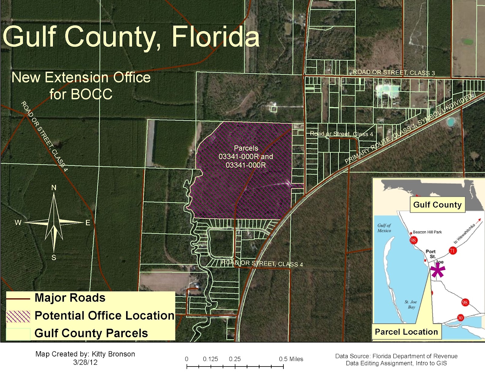
This assignment was about learning how to edit information, combining features and selecting specific information to show and creating new features.  We were using information about Gulf County to find a good location for an office for the BOCC with certain criteria such as, the property needed to be county owned, over 20 acres and vacant.

Here is the map I produced.


Process Summary Details
I saved along the way and found this very useful again since I ended up closing down and restarting a couple times.  It ended up that I was doing everything correctly but I just didn't think it looked right.
1)     Added the layers ‘GulfCounty_Roads’ and ‘GulfCounty_Parcels’ to ArcMap
2)     Used the Editor Tool to Merge the two Parcels 03334-000R and 03341-000R, changed their information in the ‘GulfCounty_Parcels’ attribute table to reflect the new status.
3)     Added the new created shapefile layer “CountyOwned.shp” to ArcMap
4)     Used the Calculate Geometry and Field Calculator tools to display wanted information.
5)     Ran a Definition query to hide the features not needed for this map.
6)     Added the new created shapefile layer “SuitableParcels.shp” to ArcMap
7)     Using the Editing tool again with the snapping tool, adjusted the roads from the ‘GulfCounty_Road’ layer to fit better. 
8)     Using the Creating Features tool, drew the road feature for the cul-de-sac development.
9)     Changed colors, added labels and essential features to map showing the new Suitable Parcels layer with parcel id, the original Gulf County Parcels and the updated Gulf County Roads.  Added an aerial basemap.
10)  Saved as S:\Data_Editing\final.mxd and exported as S:\Data_Editing_cmb.jpg